
Fonts are tools
Ellen Lupton wrote in her seminal book, “Thinking with Type”, that “Typography is what language looks like.” Your font selection affects how a visitor perceives your website. Fonts aren’t just letters that look pretty. A font is a tool.
For centuries designers have used fonts with purpose. Advertisers used Monster Fonts in the nineteenth century to draw attention on printed banners. Newspapers reached for the prominence of serif fonts. The New York Times crafted their own versions of Imperial and Cheltenham. The Washington Post built Postoni, a type derived from the timeless Bodoni. Tech companies have avoided serifs in favor of the round, friendly, and modern sans-serif fonts. Cereal is a creation of Airbnb. They built it to unify their brand across Web, Android, iOS, and print.
Fonts come at a cost
A font is like a shoe. Instead of selecting a pair based off their look, you pick for the event. Your pair of Hugo Boss dress shoes help create the tone at a wedding. But at a 5k road race you’re better off in your Asics. A properly used font sets the tone you want for your website’s brand. But it comes at a cost.
Web fonts are extra baggage on your website
In 2010 Google launched Google Fonts and made custom web fonts accessible to the world. You had a custom typeface on your site with just a few lines of copy-and-pasted CSS.
<link href="https://fonts.googleapis.com/css?family=Bevan" rel="stylesheet" />
<style>
body {
  font-family: 'Bevan', Georgia, serif;
}
</style>
Under the hood Google Fonts links to a stylesheet full of font-face declarations.
/* latin */
@font-face {
  font-family: 'Bevan';
  font-style: normal;
  font-weight: 400;
  src: local('Bevan Regular'), local('Bevan-Regular'), url('https://fonts.gstatic.com/s/bevan/v9/4iCj6KZ0a9NXjG8dWCvZtUSI.woff2') format('woff2');
  unicode-range: U+0000-00FF, U+0131, U+0152-0153, U+02BB-02BC, U+02C6, U+02DA, U+02DC, U+2000-206F, U+2074, U+20AC, U+2122, U+2191, U+2193, U+2212, U+2215, U+FEFF, U+FFFD;
}
This setup prioritizes simplicity over performance. But it leads to a nasty problem on slow connections: FOIT.
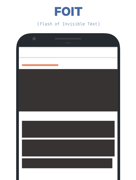
Flash of Invisible Text (FOIT)
Most modern browsers will layout the page but wait for three seconds before rendering any text. If the custom font has loaded it will appear, if not the next available fallback font is rendered. This is known as FOIT. On a bad 3G connection this usually means three seconds of a site devoid of text.
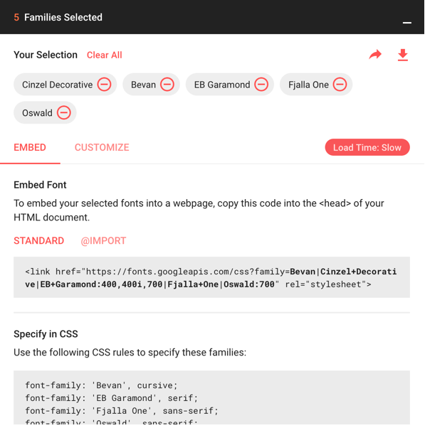
Google Fonts tries to save you. Selecting multiple fonts affects the “Load Time” label. Because in this setup, the more fonts you select the more the chance of FOIT.
Is that the compromise? Load more fonts, deal with invisible text areas. That’s the case when you use font-face alone. Thankfully there’s more performant, but more complicated, ways.
The Web Gazette: A case study
News content is one of the most interesting areas of the web. Readers expect content fast and free. News sites rely on render blocking assets such as ads and fonts. Balancing these polarizing needs is fascinating. As a small test I built a news-site.
Now to be clear, this is going to be a small scale web page. There won’t be any ads or even JavaScript for that matter. The point of the exercise is to start from the default way of loading from Google Fonts and to improve along the way. Meet “The Web Gazette”.
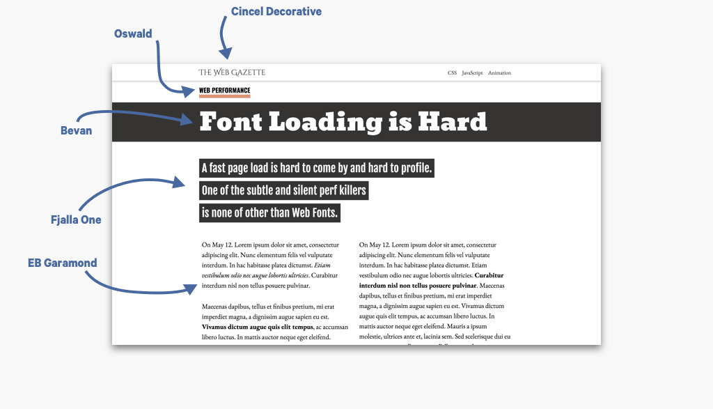
The Web Gazette uses 7 fonts: Bevan, Oswald, Fjalla One, Cincel Decorative, EB Garamond Regular, EB Garamond Italic, EB Garamond Bold. Each font choice is selective.
- Bevan’s thick, traditional, and eye-catching attributes make it suitable for headlines.
- Fjalla One is a thicker sans-serif font, which makes for a good subtitle while providing a nice contrast to the headline.
- Oswald is another standout sans-serif font that was noticeable enough to use for labels.
- Garamond is a classic humanist font that is familiar when reading news content.
- Cincel Decorative makes a great logo font with its unique flaring serifs.
Are all these fonts necessary? No. But let’s see how fast we can load the page by using all of seven. Bring on the font loading tips.
Use WebPageTest for profiling
WebPageTest is the best free tool for profiling page load. It allows you to throttle connections and use real mobile devices. For this study, we’ll use the “Easy” profile, which is a slow 3G connection. The results WebPageTest provides are comprehensive but sometimes hard to understand.
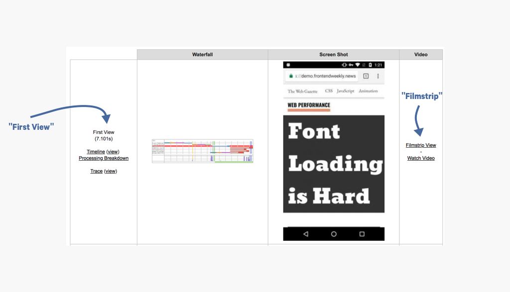
The first metric you’ll notice is “First View”. To be honest, it’s often misleading. A site can be useful or useless before WebPageTest registers the “First View”. In this case WPT says the site’s “First View” is in 7.1 seconds, which is an alright load time for the connection speed. But to understand what’s going on, we must go deeper. To the “Filmstrip View”.
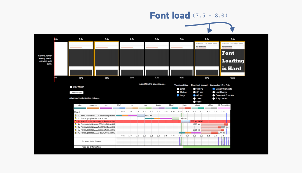
The “Filmstrip View” gives you an in depth view of what’s happening either second by second or even frame by frame during page load. It also provides a waterfall chart to see what assets are loaded during the filmstrip’s timeline. The Web Page Gazette is clearly full of FOIT. The site is FOIT-filled until 7.7 seconds and then the custom fonts load at 7.8. We’ve established the baseline. We can do better than this.
Check for local fonts first
There’s always a chance a user has your custom font already downloaded on their computer. There’s a CSS function for that: local().
@font-face {
  font-family: 'Bevan';
  font-style: normal;
  font-weight: 400;
  src: local('Bevan Regular'),
       local('Bevan-Regular'),
       url(bevan-regular.woff2) format('woff2');
}
These rules tell the browser to first look for either Bevan or Bevan-Regular on the user’s local machine before making a request for the font. If the user has the font, you’ve scored big. You won’t run into any FOIT and the font will render quickly. Google Fonts handles this for you, but it’s good to know. It’s likely the user won’t have the font and we’ll still need to handle for FOIT.
font-display: the easy way out
The good news is there’s an easy solution. There’s a new(ish) CSS property called font-display that solves FOIT. font-display gives you more control over the browser’s font rendering.
@font-face {
  font-family: 'Bevan';
  font-display: 'swap'; /* auto, swap, block, fallback, optional */
}
There’s five possible values for font-display: auto, swap, block, fallback, and
optional. Here’s how they work.
- auto - This is the default behavior (FOIT)
- swap - Render the first available fallback font and then swap it custom font when downloaded
- block - Don’t use it. It blocks the font rendering until the font is download, a disaster on slow networks.
- fallback - The browser waits for ~100ms for the custom font to load, if not it renders the first fallback font.
- optional - A bit like fallback, but the browser decides after a short wait if the font should be loaded at all.
This gives you three different options to avoid a lengthy period of FOIT. I prefer using swap, but fallback and optional are valid options as well. When I applied swap to The Web Gazette it made a huge difference.
The results of using font-display: swap
I took the Google Fonts stylesheet copied it to an embedded style tag. This way I could modify it to use font-display and it’s one less network request needed before fonts are loaded.
<style>
/* latin */
@font-face {
  font-family: 'Bevan';
  font-style: normal;
  font-weight: 400;
  font-display: swap;
  src: local('Bevan Regular'), local('Bevan-Regular'), url(https://fonts.gstatic.com/s/bevan/v9/4iCj6KZ0a9NXjG8dWCvZtUSI.woff2) format('woff2');
  unicode-range: U+0000-00FF, U+0131, U+0152-0153, U+02BB-02BC, U+02C6, U+02DA, U+02DC, U+2000-206F, U+2074, U+20AC, U+2122, U+2191, U+2193, U+2212, U+2215, U+FEFF, U+FFFD;
}
</style>
I then went and ran a profile on WebPageTest. It went a lot better.
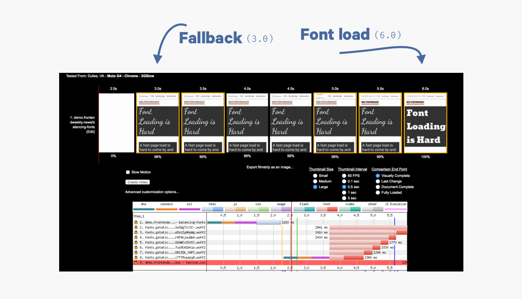
The fallback font renders in 2.8 seconds! That’s content nearly 5 seconds faster than before. The custom font is swapped out at 5.7 seconds, 2.1 seconds faster than before. On a fast network, this would be a quick process.
font-display is not supported on Edge
So what’s the problem with font-display? It’s not supported on Internet Explorer or Edge, yet. Edge is adopting Chrome’s Blink engine and will get swap soon. Until then, to include support for Edge and do some other fancy things, we can use the Font Face Observer library.
Font Face Observer to detect loading fonts
The Font Face Observer library allows you to detect when a font has loaded. Start with a fallback font, render the custom font when it’s available. This is usually done by adding a class to the document that switches to the custom font.
const bevanFont = new FontFaceObserver('Bevan', {
  weight: 400
});
// Detect when Bevan has loaded
bevanFont.load(0, 10000) // wait 10 seconds before giving up
 .then(() => {
     document.documentElement.classList.add('bevan-loaded');
 });
.bevan-loaded {
  font-family: 'Bevan';
}
This works just like font-display: swap and keeps the site from encountering FOIT. Instead of FOIT, you now have FOUT.
FOUT: Flash of Unstyled Text
In the filmstrip screenshots above the fallback font rendered first and then was swapped to the custom font. This process is referred to as FOUT or FOUC (Flash of Unstyled Content). When you prioritize content FOUT is preferable to FOIT because the reader has text immediately.
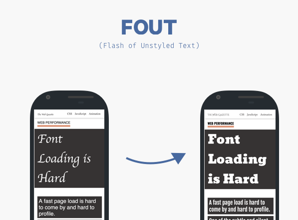
However, you’ve probably noticed that the fallback looks terrible. The current fallback discredits the tone of the site. In addition, the swap of the custom font will be a jarring process for the reader. What we want is a subtle change.
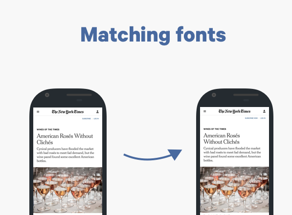
Matching fallback fonts
The New York Times does a great job with matching their custom fonts. They use Georgia as a back up to their Cheltenham and Imperial fonts. They make sure that when the font swap the change is a subtle enhancement.
How do you find a backup font? How do you make sure all the heights and width match up together? Well there’s a great tool for this and we can all thank and follow the great Monica Dinculescu. Font-style matcher is pure gold.
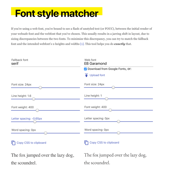
Using this tool you can compare two different fonts and adjust sizing properties to get them to match. With a bunch of tweaking you can find the right match.
link rel=‘preload’ for font files
Without any interference the browser won’t begin to download the font file until it discovers it in the CSS file. We can speed things up a bit. We can tell the browser to download specific assets immediately with the link rel=‘preload’ tag.
<link rel="preload" href="bevan.woff2" as="font" crossorigin type="font/woff2">
Note that you must use crossorigin for fonts, even if the resource isn’t crossorigin. It’s just the way it is…
HTTP/2 push is not the present, but the future
Using preload is great, but HTTP/2 push is better. HTTP/2 push allows you to send assets down with the initial document. This removes one round trip connection and therefore these “pushed” assets load much faster. This is huge on a slow network where the latency is high. But as great as push is, it’s not ready for primetime yet. Each browser handles situations differently which can lead to non-deterministic results.
WOFF2 > WOFF
A small but important note. Prefer the .woff2 format of a font before the .woff format. The .woff2 compression format offers a 30% gain of .woff. It’s available in IE or Edge, but you can provide .woff fallback for those browsers.
@font-face {
font-family: Bevan;
src: local('Bevan Regular'),
     local('Bevan-Regular'),
     url('Bevan.woff2') format('woff2'),
     url('Bevan.woff') format('woff');
}
Prelude to FOFT: Flash of Faux Text
The FOUT/swap example improves performance at the cost of multiple font rendering phases. There is still room to improve. The technique known FOFT relies on loading only the roman variant and the browser will “fake” the italic and bold versions. Behind the scenes you load the italic and bold variants and the “real” version is rendered once available.
This requires subsetting a typeface and self hosting of the font file. It reduces the amount of phases of font rendering and greatly reduces FOUC. However, it does introduce a brief period of FOIT. Learn more on Zach Leatherman’s amazing article: “A Comprehensive Guide to Font Loading Strategies”. He’s one of the best web font experts in the world, so you should follow him.
This strategy looks promising for the future, but it requires more advanced tooling. I think of the FOFT approach as an “extra mile” effort. Attempt it if you know what you’re doing or if you have the extra cycles.
A non-exhaustive check list to loading fonts
[ ] - Avoid plain-old @font-face
[ ] - Prefer .woff2 with a .woff fallback
[ ] - FOUT > FOIT for content sites
[ ] - Font Face Observer for FOUT
[ ] - Match styles for a subtle transition
[ ] - Keep an eye on HTTP/2 push
[ ] - Profile early and often
[ ] - Read Zach Leatherman’s “A Comprehensive Guide to Font Loading Strategies”
Outline
- Fonts are tools
- Fonts come at a cost
- Web fonts are extra baggage on your website
- Flash of Invisible Text (FOIT)
- The Web Gazette: A case study
- Use WebPageTest for profiling
- Check for local fonts first
- font-display: the easy way out
- The results of using font-display: swap
- font-display is not supported on Edge
- Font Face Observer to detect loading fonts
- FOUT: Flash of Unstyled Text
- Matching fallback fonts
- link rel=‘preload’ for font files
- HTTP/2 push is not the present, but the future
- WOFF2 > WOFF
- Prelude to FOFT: Flash of Faux Text
- A non-exhaustive check list to loading fonts