
Styling with CSS should be fast and iterative
The first styling technique I learned on the web was not using CSS directly, it was the style attribute. It was empowering. A few keystrokes could change the background color, font size, line-height, or whatever was needed. The best part was with one glance you could understand the style of the element.
<!-- HEADER -->
<div style="color: blue; font-family: 'Comic Sans'; font-size: 32px;">
  Welcome to my site!
</div>
It didn’t take long to understand why the style attribute was a bad idea. It lead to brittle and inconsistent styling. One update meant updating each element with that style. CSS classes were the obvious cure, but they lost the directness of style attribute. It took more than one glance to understand the style of the element. To understand the styles you had learn to associate the classes with their actual properties. The styles didn’t live on the element anymore, just some poorly named set of classes.
Creating resuable classes with consistent measurements was a struggle. This process is frustrating and slow. Styling with CSS should be fast and iterative. Building a page from scratch is fuzzy. You should be able to create a design with a loose set of rules and tighten as the picture becomes clear.
This is what Tailwind CSS provides.
Tailwind is not like Bootstrap
When you first hear “CSS Framework” you immediately think of Twitter Bootstrap. But that’s not Tailwind. Bootstrap is a set of pre-styled and themeable components. Tailwind is a configurable set of utility CSS classes. Bootstrap hands you pre-built components. Tailwind gives you the tools to quickly build your own.
To understand Tailwind, think in utilities
Tailwind provides a large set of utilties to create any kind of design you can think of. These classes are composable and within a few keystrokes you’ll have a component.
<!-- HEADER -->
<div class="text-blue font-sans text-xl bg-white">
  Welcome to my site!
</div>

Set the text color to blue, the font is the sans typeface, the text is large, and the background is white. Tailwind has plenty more utilities like this. It takes time to learn the system but once you do, you move fast.
Side note: If seeing a long list of classes makes you clinch your teeth, just hold on. It gets better. Because rapid development isn’t even the best part of Tailwind. It’s the consistency it provides with it’s values.
This site is built with Tailwind
I built this site with Tailwind in just a few days. I’m not afraid to make adjustments or create new pages. Tailwind empowers me to iterate quickly.
Tailwind gives you consistent spacing
Inconsistent spacing is a problem that plagues developers. I worked with a UX Designer who had a rule on spacing. All margins, heights, and paddings should be divisble by four. This was a loose rule. If you picked the wrong number you wouldn’t too far off. It would be easy to clean up later. This rule was helpful, but Tailwind eliminates this problem.
Here’s an example of creating a container with padding:
<!-- HEADER -->
<div class="container mx-auto px-4 py-4 text-blue-darkest">
  This is my blog. Here are some useful words.
</div>
Let’s breakdown each class:
container- This provides the width across different responsive breakpoints.mx-auto- This is your essential:margin: 0 auto;The m stands for margin. The x stands for the horizontal x-axis. This is a common pattern in Tailwind. The auto is the value.px-4- Provide1emof padding to the left and right, the x-axis.py-4- Provide1emof padding to the top and bottom, the y-axis.text-blue-darkest- Set the text color to#12283a.
These classes are configured to consistent sizes: 1 is 0.25em, 3 is 0.75em, 4 is 1em, 5 is 1.25em, and so on on so forth. This allows you to pick the size that works for you and stick to it across all spacing.
But what if you don’t like the padding sizes? What if you want a different value for text-blue-darkest? Tailwind was designed for configuration.
Configure your own values in tailwind.js
Getting started with your custom Tailwind build takes only a few commands. First install Tailwind with npm or yarn.
npm i tailwindcss
Then dig into your node_modules folder to run the Tailwind init command.
node_modules/.bin/tailwind init
This creates a sizeable configuration file named tailwind.js. It may look complicated, but it’s not. It’s just one large object with sensible defaults. With this large object you can configure the following categories: colors (text and bg), screens, font, textSizes, fontWeights, leading (line-height), tracking (line-spacing), backgroundSize, borderWidths, borderColors, borderRadius, width, height, minHeight, maxHeight, maxWidth, padding, margin, negativeMargin, shadows, zIndex, opacity, svgFill, svgStroke, state variants (hover, active), and responsive states.
Once you’re happy with your configuration, generate your CSS. First create a basic style sheet with the needed Tailwind directives.
@tailwind preflight;
@tailwind components;
@tailwind utilities;
Tailwind looks for these directives to understand what to generate. These @ directives will likely cause fits with your editor. However, this is totally fine for Tailwind. Run the command below to generate your CSS file.
./node_modules/.bin/tailwind build ./src/styles.css -c ./tailwind.js -o ./dist/styles.css
Voila. You have a built stylesheet courtesy of Tailwind.
Colors are the common configuration
You might be thinking, “Do I really need to customize each and every one of these fields?”. No. You don’t. I would wager that 99.9% of the time Tailwind users configure colors and move on. You might want to adjust the screen sizes to generate different responsive breakpoints, but that’s up to you. Tailwind provides so many options that you’ll find something that suites you.
Purge the CSS you don’t need
One common complaint of Tailwind is about its size. The stock version of Tailwind is 24.6kb minified and gzipped. This isn’t that bad, but it’s really rare to need all the generated CSS. Remove unused CSS with tools like uncss, PurgeCSS, and critters.
The generated style sheet comes in at 2.5kb. Not too shabby at all.
Tailwind is granular
Tailwind is designed to use the most granular rules to avoid style conflicts. Take a look at setting a border.
<!-- BOX -->
<div class="border-black border-solid border-b-4 h-12">
  Here's a box with granular border control
</div>
Using border-black sets only the border-color CSS rule. Applying border-solid sets a single border-style rule. Adding border-b-4 sets a border-bottom-width rule. This granularity provides flexibility while avoiding style conflicts.
Tailwind is amazing for flexbox
Utility classes win you over when you start laying out elements. Tailwind’s flexbox utilties are first class.
<!-- LAYOUT -->
<div class="container mx-auto flex justify-center items-center">
  EVERYTHING IS CENTERED!
</div>
Tailwind provides classes to set the display to flex, flex-direction to column if needed, and modify the justify-center and align-items properties. Want to create a header that aligns a logo to the left and the links to the right? No problem.
<!-- HEADER -->
<div class="w-screen text-blue font-sans text-xl bg-white flex justify-between items-center px-4">
  <h3>My Site</h3>
  <ul class="flex list-reset">
    <li class="px-4"><a href="/">Home</a></li>
    <li class="px-4"><a href="/about">About</a></li>
  </ul>
</div>
Responsive styles with classes
Tailwind builds in a set of responsive utilities. This is a little confusing at first, but it becomes powerful when you learn the ropes. Without any custom configuration Tailwind comes with the following screen sizes:
sm:-@media (min-width: 576px) {}md:-@media (min-width: 768px) {}lg:-@media (min-width: 992px) {}xl:-@media (min-width: 1200px) {}
Prefix these helpers to common Tailwind utilties to see the responsive magic.
<!-- BOX -->
<div class="flex lg:font-bold lg:justify-center">
  Responsiveness!
</div>
Start small and override for larger sizes
The tricky part is that any classes you apply at smaller screen sizes are also used at larger screen sizes. Let’s see what this means.
<!-- MESSAGE -->
<div class="font-normal lg:font-bold">
  The lg: utility makes this text bold on large screens
</div>
This works as you would expect. The text is bold once the screen width grows larger than 992 pixels. However, let’s set a class to make the text red on small screens.
<!-- MESSAGE -->
<div class="font-normal lg:font-bold text-red">
  The text is red on the large screens too? 🤔
</div>
You’ll notice that the text is red on larger screens, not just smaller screens. Also, if the screen width shrinks past 576 pixels the text color returns to black. This is the wrong way to apply responsive classes. Let’s flip the script.
<!-- MESSAGE -->
<div class="text-red font-normal md:text-black lg:text-black lg:font-bold">
  Red text only on screen widths smaller than 768 pixels!
</div>
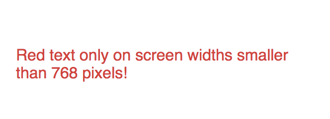
Tailwind’s responsive utilties work from small to large. Set the base styles for small screens and override them for larger screens. You’re encounter far less problems once you start thinking this way.
Set state variants with classes
Tailwind also provides utilties to style hover, focus, and active states. This are known as state variants.
<!-- BUTTON -->
<button class="bg-blue hover:bg-blue-dark text-white px-4 py-4 text-lg uppercase rounded-lg">
  Sign Up!
</button>
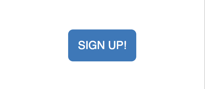
This list of classes creates a blue button that is a darker blue when in a hover state. You’ll need to manually configure active states if you want them included in your generated CSS. The Tailwind docs cover how to do this.
Tighten up long class lists with @apply
Some of you are thinking, “Enough with the classes! How is this maintainable!?”.. I hear you. The class list can get pretty long. Don’t worry though, the Tailwind creators are smart. They gave us the @apply rule.
Move multiple utilities into your own custom selector using @apply. Let’s say I want to create a class for the header above. All I need to do is open my styles.css file with the Tailwind directives and use an @apply rule.
.my-header {
  @apply .text-blue .font-sans .text-xl .bg-white .flex .justify-between .items-center .px-4
}
.btn-blue {
  @apply .bg-blue .hover:bg-blue-dark .text-white .px-4 .py-4 .text-lg .uppercase .rounded-lg
}
@tailwind preflight;
@tailwind components;
@tailwind utilities;
Run the tailwind build command covered above and you’ll have these classes for use.
<!-- HEADER -->
<div class="header">
  <h3>My Site</h3>
  <ul class="flex list-reset">
    <li class="px-4"><a href="/">Home</a></li>
    <li class="px-4"><a href="/about">About</a></li>
  </ul>
</div>

<button class="btn-blue">
  Sign Up!
</button>
Iterate styles quickly with Tailwind
Styling starts with a fuzzy picture of what classes are needed. Tailwind gives you the freedom to quickly iterate and form a cohesive style and tighen up to classes when the picture becomes clear.
Give Tailwind a spin
I create a quick and dirty Stackblitz example that uses the Tailwind CDN build. You can’t customize it, but you can see what the fuss is all about.
Outline
- Styling with CSS should be fast and iterative
- Tailwind is not like Bootstrap
- To understand Tailwind, think in utilities
- This site is built with Tailwind
- Tailwind gives you consistent spacing
- Configure your own values in tailwind.js
- Colors are the common configuration
- Purge the CSS you don’t need
- Tailwind is granular
- Tailwind is amazing for flexbox
- Responsive styles with classes
- Start small and override for larger sizes
- Set state variants with classes
- Tighten up long class lists with @apply
- Iterate styles quickly with Tailwind
- Give Tailwind a spin